


Colours in Light Painting Part 1
Colours in Light Painting – Artistic and aesthetic aspects
In Light Art Photography and Light Painting (almost), every colour can be shown with suitable lamps and spectral filters in (almost) every desired saturation and brightness. Some Light Painters are to be shown often tried possibly many colours in a picture without being aware of the effect of the colours on the eye of the viewer and the effect of the colours obviously to each other.
On the other side, there are Light Painting artists who work very strictly with complementary colours like the respected Pala Teth. If you always use complementary colours in a picture you cannot go really bad with it. Of course, it’s also a matter of taste. For example, I do not like certain colours and/or their secondary colours like violet and green.
Like with many other aspects of Light Painting or also of Photography in general, Its good to know as many “rules” possible to be able to ignore them consciously.
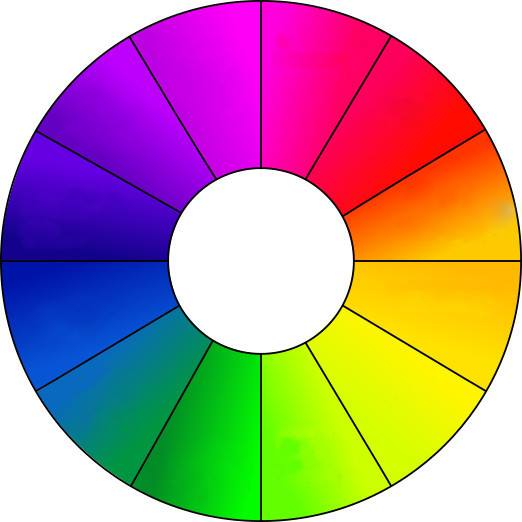
To me, it is absolutely clear that people perceive colours differently. The colour circle in the picture on the top of the page has certainly no general validity. Some people like some colour specific combinations which others might not. What most viewers of Light Painting might find “annoying” is the use of many “strong” colours in one image. If I take myself as an example, I find pictures in which strong red, strong blue, strong green and possibly still yellow and violet were used at the same time, not so pleasing even if they are well made otherwise.
Which options for colour creation do we have in Light Painting
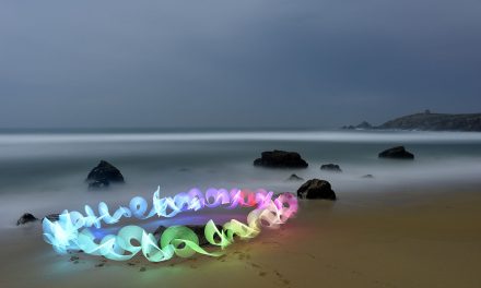
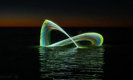
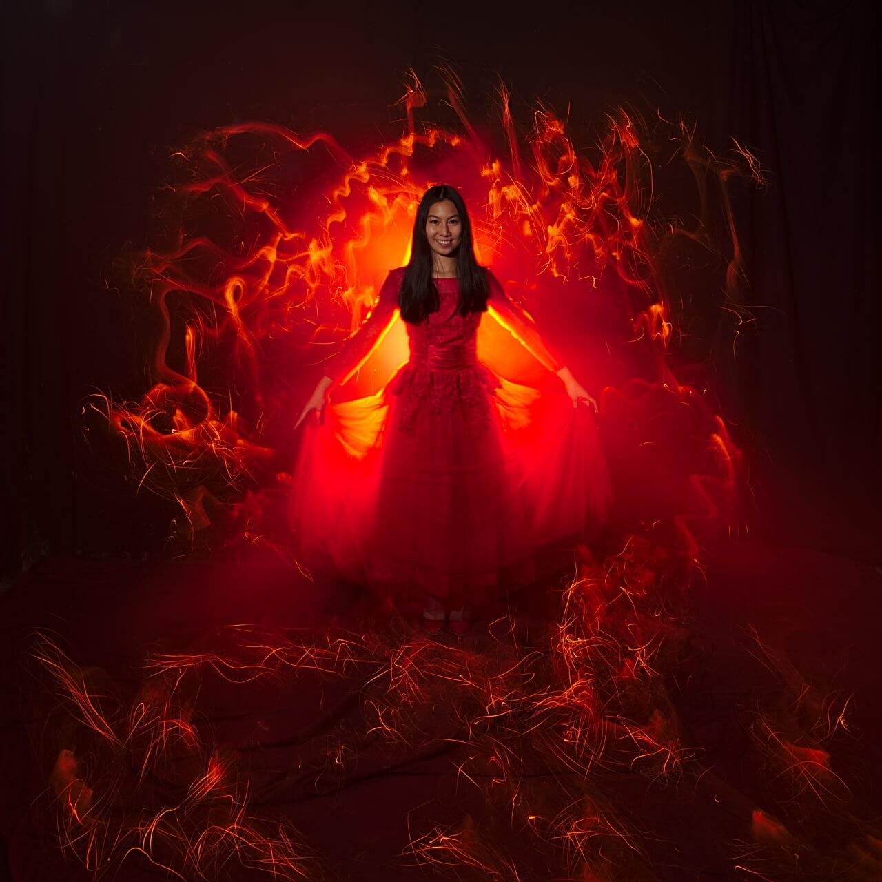
Have a look at the two images below. In the first, the light has a similar colour to the dress of the charming model. It’s very important with this kind of Light Painting to have a rather strong bright light source in the picture, otherwise, it looks very quickly flat and dull.
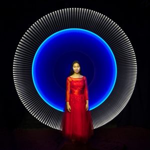
The second image is what I mentioned before on working with complementary colours. In the colour wheel picture on top of the post, the blue light is the complementary colour of the red colour of the dress. Though the blue does not correspond precisely compared with the colour Red in the colour circle, however, the effect of both colours to each other is still harmonious. The white external part does not disturb the perception of the colours. White colour can be always combined together with all colour combinations in Light Painting.
on location with models
Working in locations where the background is more visible, is more difficult. Take as an example the pictures at the department store Görlitz below.
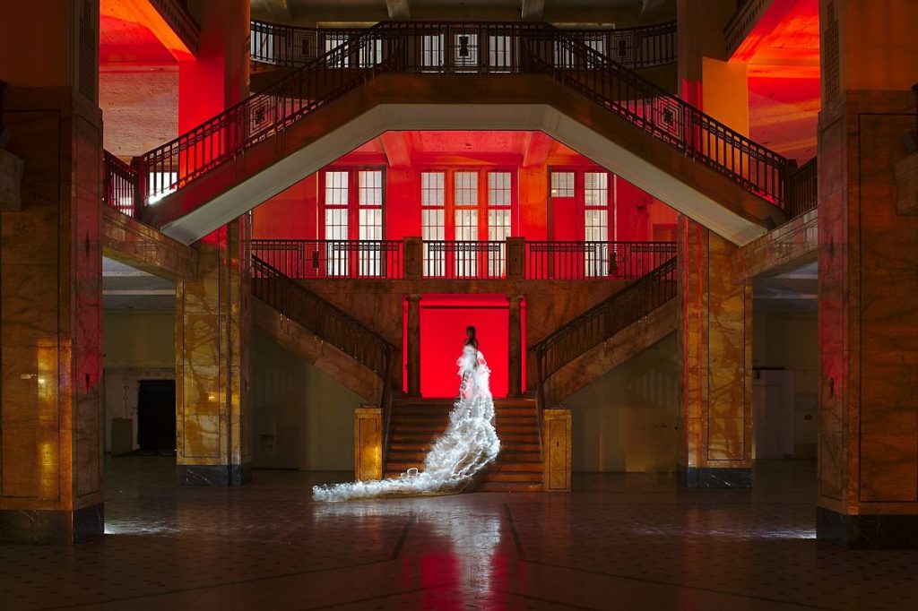
First of all, we couldn’t really do much from the street lights that affect the image cause of the big windows of the place. We had to use this light in the picture instead. Fortunately, this light was almost white.Here I have consciously chosen no complementary colour for illuminating the space, but one of the “natural” colour of the columns and a similar one for the floor.
For the dress, we would have had several colours to choose from. Either red like the prevailing part of the scene, turquoise as a complementary colour to Red/orange, or the white as we did in the end. A woman in a white dress has quite different meaning for the picture statement than a woman in a coloured dress.
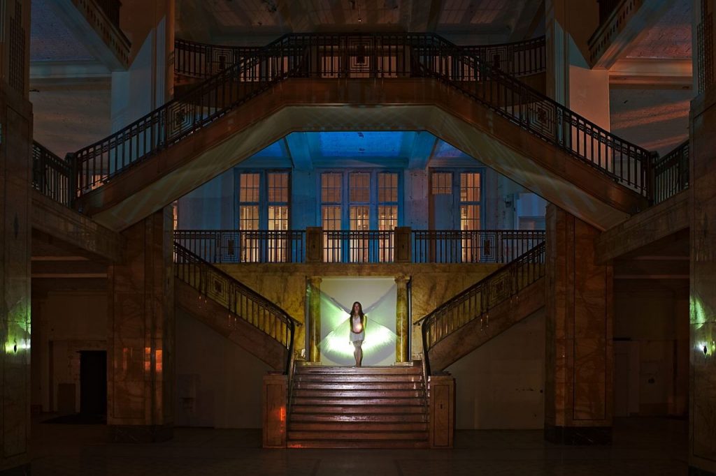
In the second image from Gorlitz Marla had a different approach.She used the natural colour of the building by illumination with a white lamp. Then she used a complementary colour to the available light this bright blue for the area above the model. The greenish light in the wings is rather unintentional and was caused by the colour of the iridescing material. But it fits from the brightness and saturation perfectly to the tender blue. Therefore the big windows were illuminated only by the orange sodium steam lamps of the road lighting.
In general, you will have a substantially more harmonious picture as a result if the number of the colours you use is limited from 1 to 2. especially when working with models. Too many, too garish colours could change the focus of the viewer from the real motive.
Without models
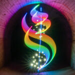
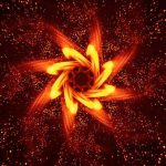
If, however, the main motive is a light figure as for example an Orb, you can use colours to direct the viewer’s focus. Of course, we should always pay attention to a nice combination of the colours, even if these two colours are not complimentary ones, like in the picture below with the yellow orb. If I had used here, a strong blue or lilac that might have not been a pleasing result.
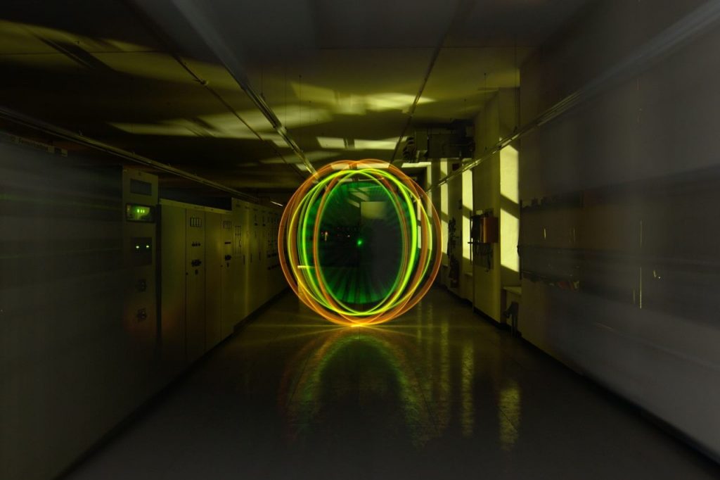
There is absolutely nothing wrong with experimenting with different colours. I don’t mean never use more than 2 colours in a picture. However, you should always pay attention to the effect of the colours when the first moment of joy by spinning a perfect Orb is over. To let work tried only the colours on you all the same as well the picture otherwise has become. Most people see the picture as a whole with all his strengths and weaknesses, they don’t really care about how technically perfect is your orb…
Other aspects of colour
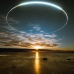
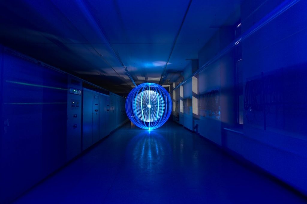
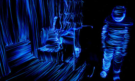
Apart from compatibility, there are more aspects of colours in the Light Painting. There is, based on the wavelengths, very difficult colours. Such a difficult colour is a blue. Blue “eats” the sharpness and depth in the picture and burns out very fast. In the picture above with the blue orb you can see it quite well below and on top in the Orb.
This picture had depth primarily by the additional zoom effect, and by the light of the windows. The sharpness of course, in this case, refers only to the Orb, cause the zoom effect is not sharp anyway.
By contrast, the long-wavy colours are rather easy to steer in Light Painting. Red becomes first orange, then yellow and then white.
Stay tuned for the second part where I m gonna talk more about the meaning of the colours and the phycological effect they have on people.
Alle the best! Sven
ps: Thanks to Jannis Sid for helping with the translation
