
Colours in Light Painting Part 3
Physical aspects of colours in light painting
The first two parts of Colours in Light Painting article, was more of a theoretical nature. In this part, we are gonna deal with the technical implementation in light painting. Which colours are easy to use, which are not? Can I mix different colours in the Light Painting, and if so which and how?
If you have not read the first two parts yet you can find them here:
colours-in-light-painting-part-1
colours-in-light-painting-part-2
The original German version can be found here:
farben-im-light-painting-teil-3
In the Light Painting, you can use with the proper flashlight and the necessary experience almost any colour in any desired saturation and brightness. However, when trying to mix different colours, we are very often doomed to failure.
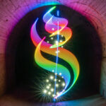
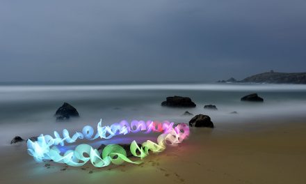
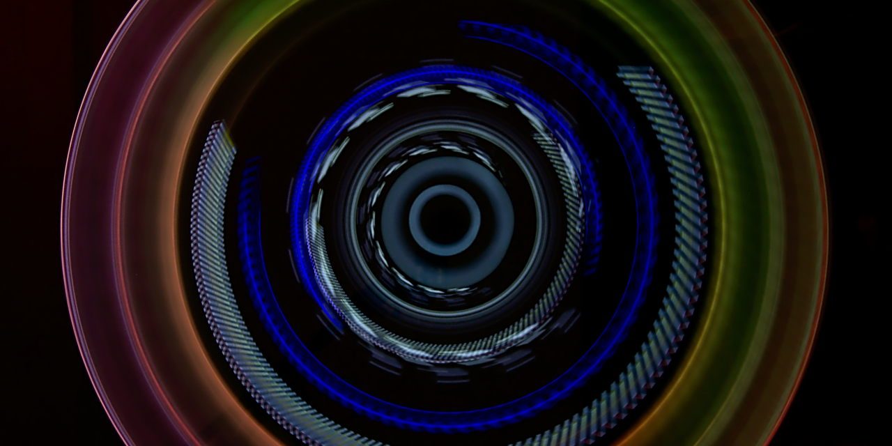
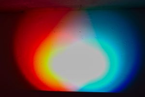
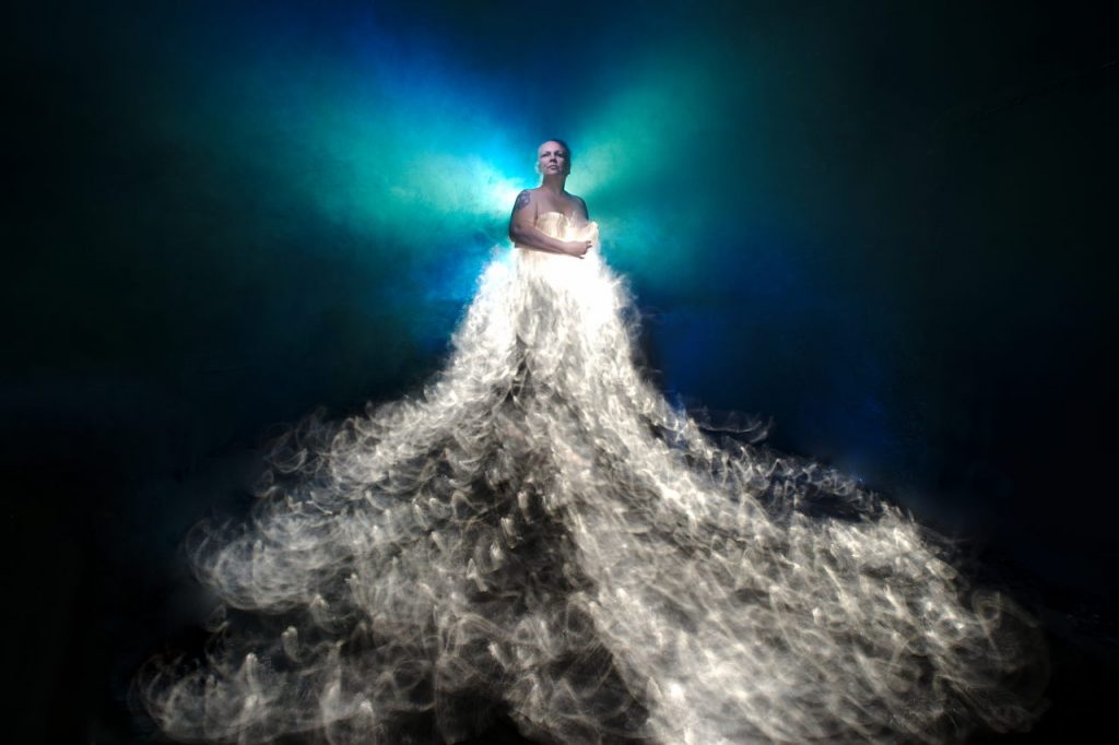
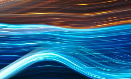
Displaying “all” colours in an image like the “Photonenrotor” above is anything but easy. I worked on this picture for several days. The exposure time was 131 seconds.
The blue light I achieved with a Led Lenser M3R with blue colour gel, both attached to a piece of acryl. On another piece of acryl, I stuck a second M3R without gel. On this acrylic blade, I had attached outside two small pieces of colour gel (red and yellow). The third part was exclusively white (middle). By changing the focal length during the exposure, the traces of the blades are visible several times in this Light Painting.
The outer ring with the colour gradient, I have realized with an LED flashlight with colour change mode. The difficulty was to adjust the rotation speed to the speed of the colour change and to determine the number of rotations for the desired effect. This soft light with the clean colour gradient can hardly be converted with a single rotation.
However, such light paintings only work without further light. By illuminating the room, I probably would have shone off half the outer ring again. It would also be impossible to make the outer ring much brighter.
But why is it like that?
Subtractive and additive colour mixing
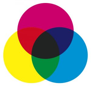
Back in school, we learned how to mix colours after subtractive colour mixing. From the 3 primary colours yellow, cyan and magenta all colours can be mixed. The more colours I apply to the sheet, the darker the mixed colour will be. If I paint all 3 primary colours in equal proportions on the sheet, the result is a dark brown, ideally black. However, in the physical sense, black is not a colour but the absence of light. Almost all printing processes use 4 colours: cyan, magenta, yellow and black.
The subtractive colour mixing, however, has no validity when I work with light. The more light I put on each other the brighter the result will be. In additive colour mixing, the 3 primary colours red, green and blue do not turn black but white. Neither can I mix brown with red and green light. I have no way to colour parts in the picture with light black, Black is in Light Painting always only parts of the picture without any light.
So in light painting, we first have to forget the knowledge of colour mixing that was learned at school and stored in our memory.
Theoretically, in light painting, you can render any colour as you would on an RGB monitor. Practically, this is very difficult. In the monitor, the individual pixels are cleanly separated from each other and do not affect each other. Every single pixel in the monitor is controlled with exact values for colour mixing and brightness. In light painting, we usually work with flashlights. These light up always a larger area, unlike the micrometre-sized pixel of the monitor. Also, there is no flashlight which has the brightness evenly spread across the light cone. Consequently, when using colour gels, the colour in the light cone is also not uniform.
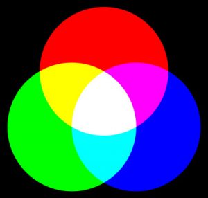
In theory, the primary colours mix as follows:
RED – GREEN = YELLOW
GREEN – BLUE = CYAN
RED – BLUE = MAGENTA
RED – GREEN – BLUE = WHITE
In practice, this often looks different. I have a clean mix only if the brightness of the colours is identical, the colours are “clean” and the illuminated area is hit evenly by the light and the area reflects the light neutrally.
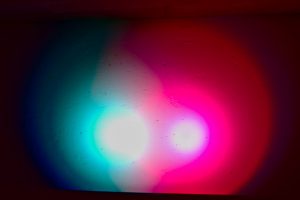
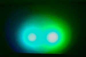
Here are some test shots on the white cellar wall:
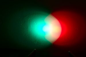
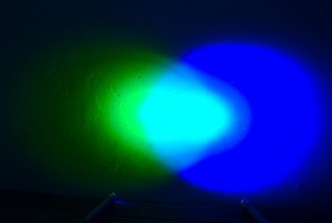
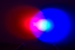
As you can see, a clean mix of colours is not possible. I used two identical RGB flashlights here. The distance of both lamps to the wall was the same. The lamps do not project a clean, uniform cone of light. However, the secondary colours yellow, cyan and magenta are recognizable in some areas of the overlap.
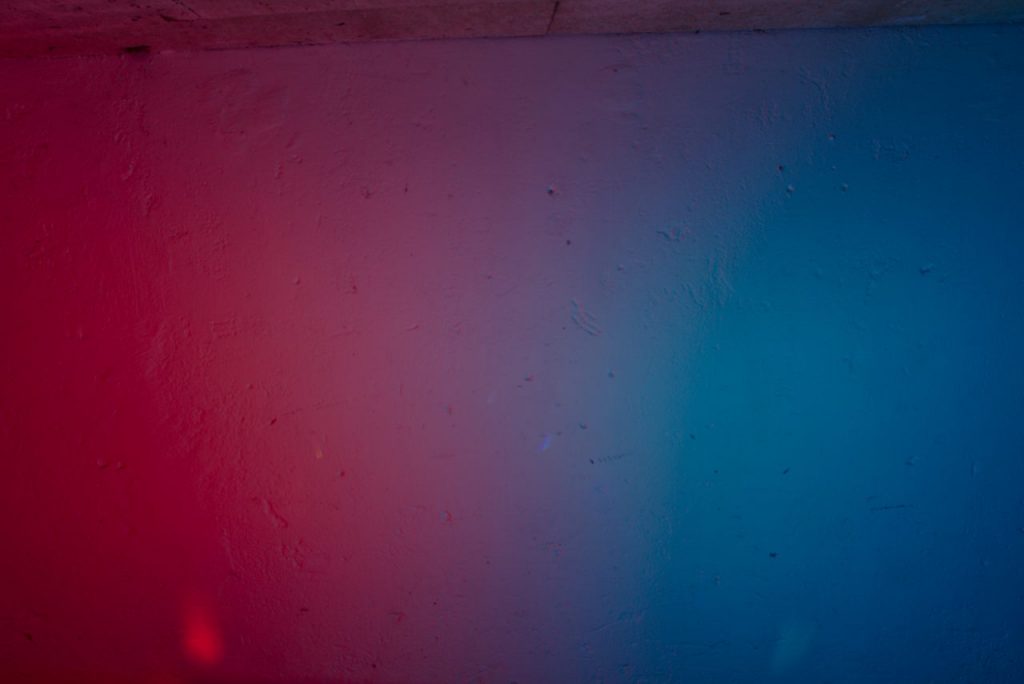
If I mount the flashlights on an acrylic blade or another light tool, which distributes the light quite evenly, it looks different. In that case, the light will not finally be reflected off the wall or any objects.
If I do not know how to illuminate an object or part of a building with 2 colours, the result is even less clear.
Mixing the primary colours produces the 3 secondary colours yellow, cyan and magenta. What happens when mixing the primary colours with the secondary colours?
RED – CYAN = WHITE
GREEN – MAGENTA = WHITE
BLUE – YELLOW = WHITE
In large areas, the light is burned out here. Above the burned out spots it is easy to see how the colours mix. This is becoming more or less grey, and only in theory does this become white. If a larger area is lit up, it usually does not look good. Apart from that, I could then illuminate the scene with white light.
When working with several secondary colours or a primary colour and a secondary colour, you should always take care that you separate the colours in the illumination cleanly from each other to avoid these ugly grey areas. This is not so difficult in most rooms. For the illumination of people or objects, however, this can quickly become a major challenge.
When working with colour gels, nothing else happens when working with RGB flashlights as in the pictures above. The colour gel does not colour the light but only blocks all wavelengths except its own. A red filter allows only red light, the rest of the spectrum is blocked.
With colour gels, however, I can use other flashlights or flash units. With surface flashlights or a flash with a softbox, the light is softer and thus more evenly distributed. It does not burn out as fast as in my example pictures above. However, the area in which both colours illuminate the wall at the same time will be larger.
Above a practical example. Behind the enchanting Marla, I fired two flashes, one with a blue and the other with a green colour gel, several times. This created blue and green areas, areas in which the light burned out, that is white, is and which mix in which the two colours to cyan. In darker areas, the colour then goes somewhat towards grey, but this is mainly due to the reflection properties of the fog. After all, fog is not a clean reflector. But exactly this structured light with the many nuances I wanted to have here, a “clean” area behind the model would be very boring as I think.
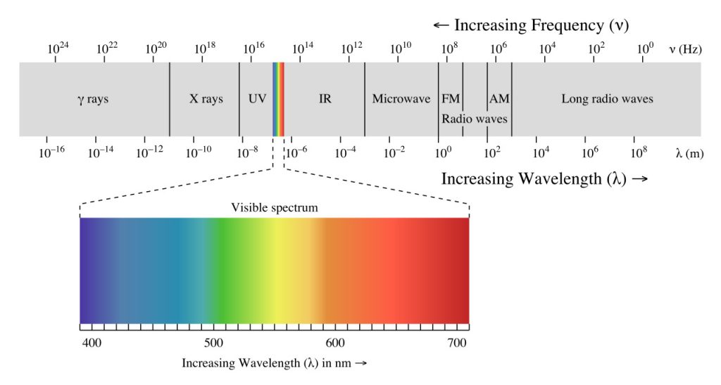
Light spectrum – Wavelength
Invisible light in Light Painting
Light visible to the human eye begins with violet at 380 nm and ends with red at 750 nm wavelength. The UV light located below 380 nm can be indirectly made visible by excitation of fluorescent substances.
In the picture above, I illuminated the artwork of Sokar Uno with a Led Lenser X21, which had been converted to UV light. The fluorescent particles in the colour reflect the UV light, the rest of the scene reflects almost no UV light. Because the fluorescent materials under visible light illumination are indistinguishable from normal reflective materials, illumination with UV light only works with some test shots. The camera usually “sees” more UV light than the eye.
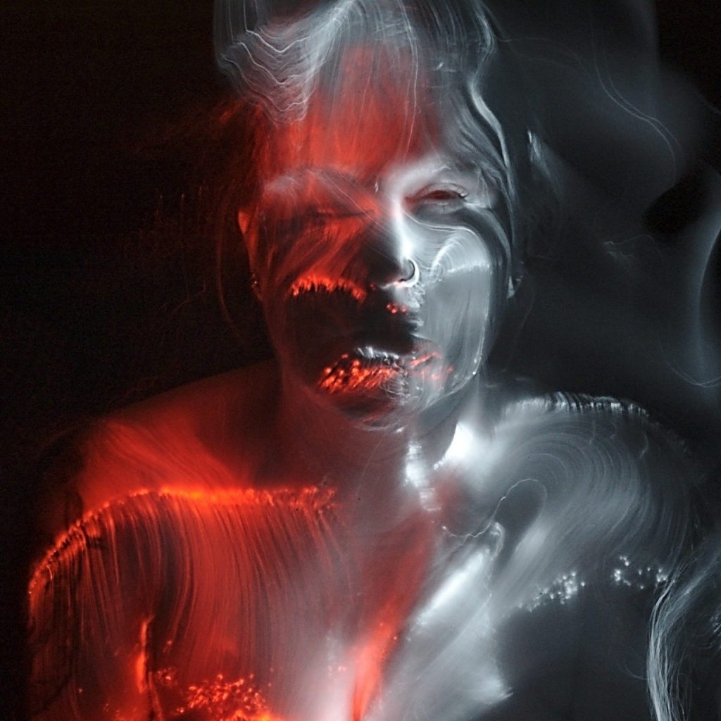
At the other end of the spectrum, we have infrared light. This is also invisible to the human eye. In contrast to UV light, infrared light cannot be visualized with any reflective material. You can still use it in Light Art Photography. Almost all digital camera sensors can record infrared light.
For the picture above we used a converted Nikon D70. One part of the light painting was made with an IR flashlight, the other part with a regular flashlight with red colour filter gel.
Working with infrared light in Light Art Photography is anything but easy. After all, you work completely blind, you can not see what you are doing. Whether I have met all the desired places in the face of the model Marla with the fiber optic is still relatively easy to feel. Whether the brightness fits, however, you always see in the result.
Visible light in Light Painting
Light with wavelengths between 380 nm (violet) and 750 nm (red) is visible to the human eye. This area corresponds to the light spectrum of the rainbow. White light is decomposed into its individual components by refraction. Some colors are not part of the color spectrum, such as brown. There is no brown light. Although in light painting you can display (almost) brown light with very dark orange light, the color display also depends on the “correct” white balance in the camera or in image processing. It is not “real” then.
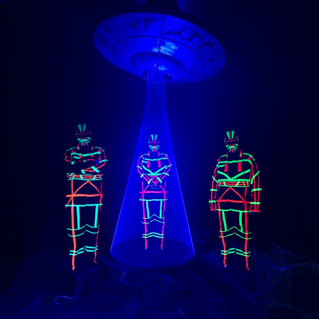
The shorter the wavelength of light, the more difficult it is to deal with it in light art photography. At least when we look at the visible area of light. UV light is quite easy to control. Since it is not visible directly, it does not burn quickly, as can be seen in the picture on the left side. Suit and mask are covered with UV tape. The UFO is painted with silver colour, this obviously has a very high proportion of fluorescent particles.
It becomes difficult with the visible colours violet and blue. These “eat” the sharpness and depth in the picture and burn out very quickly to white. With the long-wave colours that do not happen so fast. A red light turns orange and then yellow before it burns out to white.
Some tips for dealing with coloured light
Use diffusers, bouncers or small softboxes in front of the flash. Soft, diffused light is easier to control than hard light. The light of flashlights can be easily softened with baking paper.
Of course, you can put the flashlight in the little softbox. Another possibility is the illumination with indirect light by means of a reflector.
Use brightness-controlled flashlights.
With the eye is usually not visible if the flashlight is still lit with 100% or only 80%. The camera sees this, however, immediately. Most Led Lenser flashlights can be programmed so that they always shine with full brightness and turn off when the battery is too low. Most other flashlights darken continuously as the battery level decreases.
Always use the same flashlights.
When experimenting with new, great flashlights you can waste a lot of time. I speak from experience. In the meantime, I use the Led Lenser M3R and P5R.2 for brushes in most light paintings and the X21R.2 for illumination. I do not have to make dozens of test shots with these lamps; I know how bright they are.
Always use the same colour filter gels.
When using a red gel from manufacturer A and a blue foil from manufacturer B, sometimes some surprises in light painting can happen. Blue too light, red too dark, or the other way around … The density of the gel is sometimes quite different. We usually buy par 64 pattern booklets with many colours, within the booklet we usually experience no surprises.
Use only one RGB lamp.
When using RGB headlamps or RGB flashlights, we have already experienced some funny surprises. Since these lamps are usually made quite cheaply in China and for purposes outside the light painting pretty schnupp is whether the colour is exactly right there are quite large deviations. Two lamps set to blue and..shit is, one is more purple than blue in finished light painting. Even funnier is the use of mixed colours like orange. The better method is to use only one lamp and change the position for illumination if your planned choreography allows it.
I have just read this post through … quite long it has become. But if you made it all the way to here, it was obviously not boring…
Always good light.
Sven
Thanks to Jannis Sid for helping with the translation.