


Colours in Light Painting Part 2

COLOURS IN LIGHT PAINTING PART 2
We continue here with the second part of colour theory. If you haven’t read THE FIRST PART YOU CAN FIND IT HERE
MEANING OF COLOURS AND EFFECTS ON THE PEOPLE
They say you cannot find two persons who perceive colours exactly the same. However, almost everybody will indicate Red as Red, and the meaning of the colour will be also similar for many people. Certainly, many people will interpret colours differently than me in this post. Many associations to certain colours or combinations of colours have a religious or cultural origin. For people from other cultures and religions, the same colours have quite a different meaning than for us European. Even as an atheist, agnostic or nihilist no one can escape entirely from this effect, especially not if he has grown up surrounded by Christianity. Only the colours blue and green might probably have a similar meaning for all people; sky and sea are blue, finally, on the whole earth; most plants are predominantly green.
BLUE:
Blue looks reassuring, peaceful, serious, cold, distant, infinite, rational and a little bit discouraging. Blue is understood often as a symbol for peace, permanence, passiveness, harmony, trust and loyalty. In almost all religions a connection with the sky, and the higher beings living about that, is created with the colour blue. In the material world blue is often to be found as a symbol of peace, UN, dove of peace etc. If round us everything is blue (sea, sky) we are quiet ordinarily and relaxed.
In Light Painting blue is technically seen a difficult colour. Blue kills sharpness and depth in the picture, due to the short wavelength of blue light burns out very fast.
RED:
Red means passion, energy, love, action, success. Red is warming as a symbol of fire and is powerful. Red excites immediate attention, therefore, is the colour of many warnings.
In a Christian religious point of view, blood, fire and the sufferings of Christ are symbolised with Red. In China is Red the colour of luck and wealth.
Red light can be steered in Light Painting very well. If I use too strong red light, it burns out not as fast as blue, but becomes first orange and then yellow.
GREEN:
Green stands for health, growth, nature, youth, freshness, spring, hope and poison. Many green plants are also really toxic for the person. Most children do not want to eat the spinach because it is green and not because it tastes bad, like an inner precaution, so to say. On the other side ancient knowledge says us that survival is only possible for us if fresh green from the earth sprouts.
This colour is often used in hospitals by the reassuring and healthy effect and also in elevators, at least in old times with considerably less vandalism.
Green is the colour of Islam which said prophet Mohammed that looking the colour green is a service for god. The remedial bringer of the christianity Jesus entered with a green palm whisk in Jerusalem.
In the middle of grey, dark winters we put to our homes the evergreen christmas tree, a symbol of hope, a pagan custom.
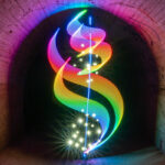
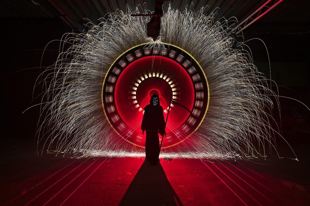
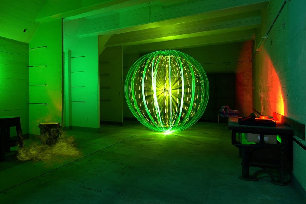
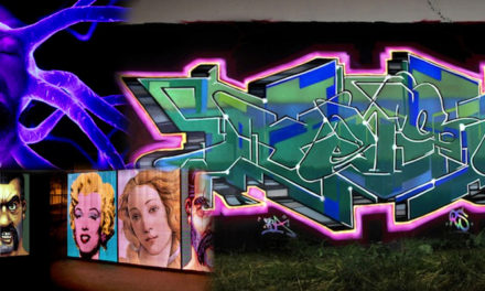
In the picture above you can see quite good that the red light of the X21 on the right side becomes too yellow-orange and to the other that green burns out rather fast. The lower part of the Orb as well as in front (the lamp shines at this point directly in the camera) is burnt-out. If the sensor receives information with too much brightness, there is nothing you can do even in post-production. In case of the Orbs this can be avoided during the admission in the front area by fade-outs. In the lower part rather not because there all lines of the Orbs meet. If I had dimmed there so far that the place below does not burn out, there would be hardly anything to be seen from the remaining Orb.
Such a thing is certainly still ok for most people when you are watching it on a monitor,, however, on prints, it does look like shit. Hardly no one would hang such a picture at 3-metre width about the couch, sometimes completely emancipated from the motive.
YELLOW:
Yellow is the colour of the sun, is brightest and friendliest of the colours introduced here. Yellow symbolises cheerfulness and optimism, however, is also very meddlesome. The negative interpretations are envy, jealousy, betrayal and cowardice. Yellow is used often as a colour for warning tips before dangers (poison, high voltage and similar). Most people abstain from Yellow instinctively. A Light Painting with high yellow portion will hold many viewers therefore also on distance. However, in small parts, we can use yellow light well in Light Art Photography.
ORANGE:
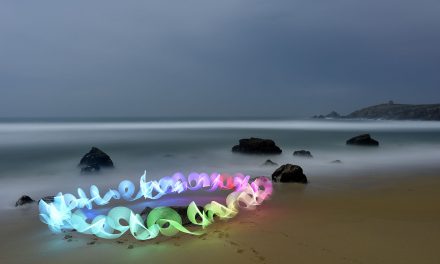
Orange stands for joy of life, energy, warmth and exoticism. Most people have no negative association with this colour. A picture with a high portion of orange light will appeal to many people immediately positively. Orange light can be used in Light Painting nicely. The connection with the complementary colour blue or bluish green (according to the brightness of the orange colour) is an often used colour combination in Light Painting. Pleasing to the eye and mostly without negative feelings and meanings. This colour combination comes close to the mood of a sundown by the sea and generates, therefore, with most people immediately positive feelings.
VIOLET:
This colour is taken in contrast to orange almost completely with negative meanings and feelings, grief, rest, penalty, sexual frustration. In the religious sense, the colour symbolises the connection of body (red) and mind (blue). And exactly this also happens in the Light Painting by use of both colours very fast. At places of the overlapping of the red and blue light, it becomes quite quickly quite violet. I use personally extremely seldom (intentionally) violet in my pictures, I do not see this colour simply with pleasure.
WHITE:
White meant light, decency, cleanness and neutrality. You can use white light in almost every picture without hesitation in combination with other colours or also as the only colour.
BLACK:
Black is no colour. Black is the absence of light. Black is the symbol of bad, of grief, death, darkness and evil. In Light Painting, we will often have more or less big black areas in the picture. Also in “normal” photos, bigger areas are often black. Our eye is accustomed to it, the least will get fear attacks at the sight of such pictures or fall into a deep depression. Using a black (dark) background our Light Paintings get generally only the desired effect. A lot would not be visible on a bright background. We need black in most pictures.
Colours as brown, grey and gold play in my opinion no big role in Light Painting because its hard to implement them. That’s why I will not come further with their meaning.
Conclusion
What I write here are neither a law nor operating instructions, take it as suggestions and explanations. It is rather helpful if you know why the violet light is less pleasant than orange.
I often make the same picture with different colours and colour combinations and look then which version is best for me. You should not stop experimenting and doing only orange-blue pictures because the effect is good. This can go quite quickly quite boringly for you and the viewers of your pictures.
All the best! Sven
ps: Thanks to Jannis Sid for helping with the translation